With web design teams struggling to reach 80%+ speed scores on Google speed tests with gorgeous – but heavy - WordPress templates and themes, some programmers are dropping WordPress themes completely in favour of building in new technology – such as Oxygen or AMP.
Will this create an exodus from the current WordPress themes - templates or will WordPress developers respond with lighter themes? The jury is out, and it's time for theme developers to cotton on.
WordPress is the predominant web development tool due to its ease of use and huge number of stylish templates and themes that save development time and make plugins affordable to all. However, these themes have been heavy due to the 'take it all or leave it' philosophy.
The lure of designing a stripped-down site that meets Google's requirements can earn a lightning AMP symbol, but these sites reduce the overall customer experience. From the 'speed' perspective, sure they deliver the info quickly, but from the 'design' perspective, they can be devoid of personality.
Google is aggressively pushing speed in the mobile environment as a critical ranking factor. Most templates and themes come with "extras" incorporated which need to be downloaded, creating slow download times.
Oxygen provides the flexibility to continue designing unique sites that reflect clients' personalities but that are light enough to significantly improve speed scores.
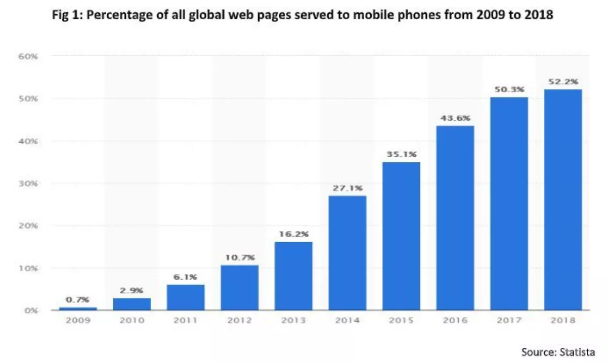
Mobile has rapidly taken over as the preferred medium for viewing websites on a global basis and Google has reacted by adjusting its algorithms to continually prize mobile content.

Today the basic mobile recipe for a good search visibility is:
- Less than 3 second loading times
- Consumer relevant content
- Clear mobile UX journey
The shift to a mobile-first philosophy has helped focus the mind on making the customer journey as frictionless as possible, but still does not entirely solve the problem of loading speeds. Now it seems developers are at a crossroads:
Accelerated Mobile Page (AMP) design. The philosophy is to strip the mobile site to the bare bones of content and tailor the content to match the consumer's needs. This is very effective if you have a highly structured site e.g. news or a portfolio site (e.g. Airbnb) where you have frequently changing content within a structured environment. However, for most clients this is simply not an attractive option given the nature of their business and the cost involved. If your site meets Google's criteria, the site earns a lightning symbol and gets hosted on Google's own servers, so it's super speedy.
Develop in Oxygen: Oxygen takes a different approach. The development environment allows you to continue utilising attractive graphic design and create custom sites by providing a blank canvas. You then add what you want - leaving what you don't - the theory being that good design coupled with the exclusion of the unnecessary extras will help achieve loading speeds that are comparable to AMP, albeit without the lightning tick. You can still use a few useful plugins.
Does that mean companies are going to have to rebuild websites?
It depends on how well they are ranking. If you're in a competitive industry and you're not making the top four places, then you've got to do what it takes to stay in the game. If google says 'speed up', you have to up your game.
What can you do today?
If you are not ready to rebuild your site today, here are some ideas for getting the best mobile experience out of your current site:
- Strip out all content from the homepage and landing pages that is not directly relevant to the site.
- Use analytics to determine your customer journey and make it front and centre (and put anything not related on internal pages)
- If you are using imagery, use nextgen tools such as tinypng.com to reduce image size, without loss of quality
- Reduce written content to small, biteable chunks
- Use App design to guide your mobile website experience
- Investigate a 'hybrid' solution; 'progressive web apps' combine the functionality of an app with the accessibility of a website.
- Employ lazy loading (content above the fold is loaded before that below the fold)
- Say what you need to say within 3 swipes.